Top Ten Tuesday is hosted by The Broke and the Bookish, make sure you go an check it out! It’s a ton of fun.
First 5 Cover Trends I Like:
1: Pictures under the cover jacket of hard cover books.
For some reason I love finding pictures under cover jackets. Sometimes they have a map of the story, or just extra pictures that go along with the cover. Either way I'm really enjoying this new trend.
2. Cover's the concentrate on the title of the book.
These are the covers with the fun and colorful fonts that capture your attention. I think these covers are just so beautiful and just look great.

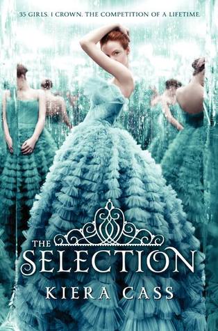
3. Pretty Dresses.
I know most people don't like the trend of girls in dresses on the cover of their books. It's been around for awhile but it's something that I have always loved. If I see a book cover with a pretty dress I have to pick it up.

4. Naked Books.
By naked I mean hardcover books with out jackets on them. There aren't to many books like this right now but it seems to be a trend that is picking up.
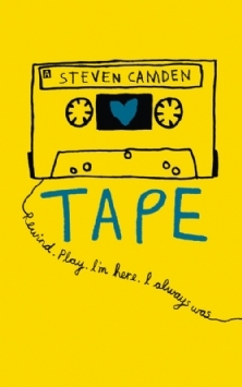
5. Doodles
This was is hard to explain. Basically I love covers like Tape by Steven Camden. They are cute, quirky and simple.
This was is hard to explain. Basically I love covers like Tape by Steven Camden. They are cute, quirky and simple.

5 Cover Trends I Hate
1. When an authors name is larger then a title
I know this is a big trend in adult with big authors but it's been showing up in Young Adult. Sometimes I have trouble figuring out where the title is.
I know this is a big trend in adult with big authors but it's been showing up in Young Adult. Sometimes I have trouble figuring out where the title is.

2. When the authors name is too small
On the other side, I also don't like when the authors name is tiny and almost impossible to find. I'm sure the author doesn't like that much either.
On the other side, I also don't like when the authors name is tiny and almost impossible to find. I'm sure the author doesn't like that much either.

3. A Kissing Couple
Because that's a book I want to read in public.

5. Slutty Covers
This goes along with a kissing couple but sometimes a cover just looks slutty. These are the ones I buy on my kindle because I get embarrassed reading bringing these covers with me when I go out.
 |
| expect I love this book and own a copy of it |

I also hate the kissing and almost-kissing covers. Boring, and uncomfortable for me to look at. I love the naked books, since they remind me of classic novels which often didn't have cover illustrations and just had some squiggly design or geometric pattern.
ReplyDeleteMy TTT
I'm with you with the kissing/slutty covers. They just make me judge the book which isn't fair!
ReplyDeleteI love it when covers have pictures under the cover! Since You've Been Gone is one of the first books I've seen do this - I hope this trend continues!
ReplyDeleteAlso, I don't like it when the authors name is too small either.
Great post! Here's my TTT
#1, 4, and 5 are trends we're enjoying too!
ReplyDeleteBtw, for a great example of #2, you should check out the cover reveal (and giveaway) we just hosted for Jasmine Warga's MY HEART AND OTHER BLACK HOLES: www.weheartya.com/2014/06/introducing-my-heart-and-other-black.html
We don't do cover reveals or other blog-tour type stuff normally, but Jasmine is a good friend, and her cover is so cool!
Pictures under the dustjacket (or really, even designs underneath) are indeed awesome.
ReplyDeleteAlso, good point about the author's name in tiny print...I can't imagine the author would be very happy about that, LOL!
I really like the naked books, I've not seen them around but it is definitely something I would love on my shelves!
ReplyDeleteAimes @ What Aimee Read Next